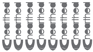
From a group crit, it was decided the use the idea on the earth and the spade needs to be develop. The shape that was representing the earth needed to be developed further to make it resemble it better. Also it was decided that the bottom of the spade was a very suitable point and that it should be kept. The earth element will also be incorporate. The following is I developing the logo to finalisation. The colour has been decided to use a grey pantone colour Pantone DS 323-3U, the colour is very modern and contemporized.
I have chosen two of the further developed logo solutions. I have been asked to extend the earth impressions to beyond the bottom of the logo and extended it to the widest part of the spade. I have chosen to highlight it using a range of reddish colours for the Pantone Colour Book.


No comments:
Post a Comment